


Sunsana Snacks
GRAPHIC DESIGN / BRANDING / LOGO DESIGN
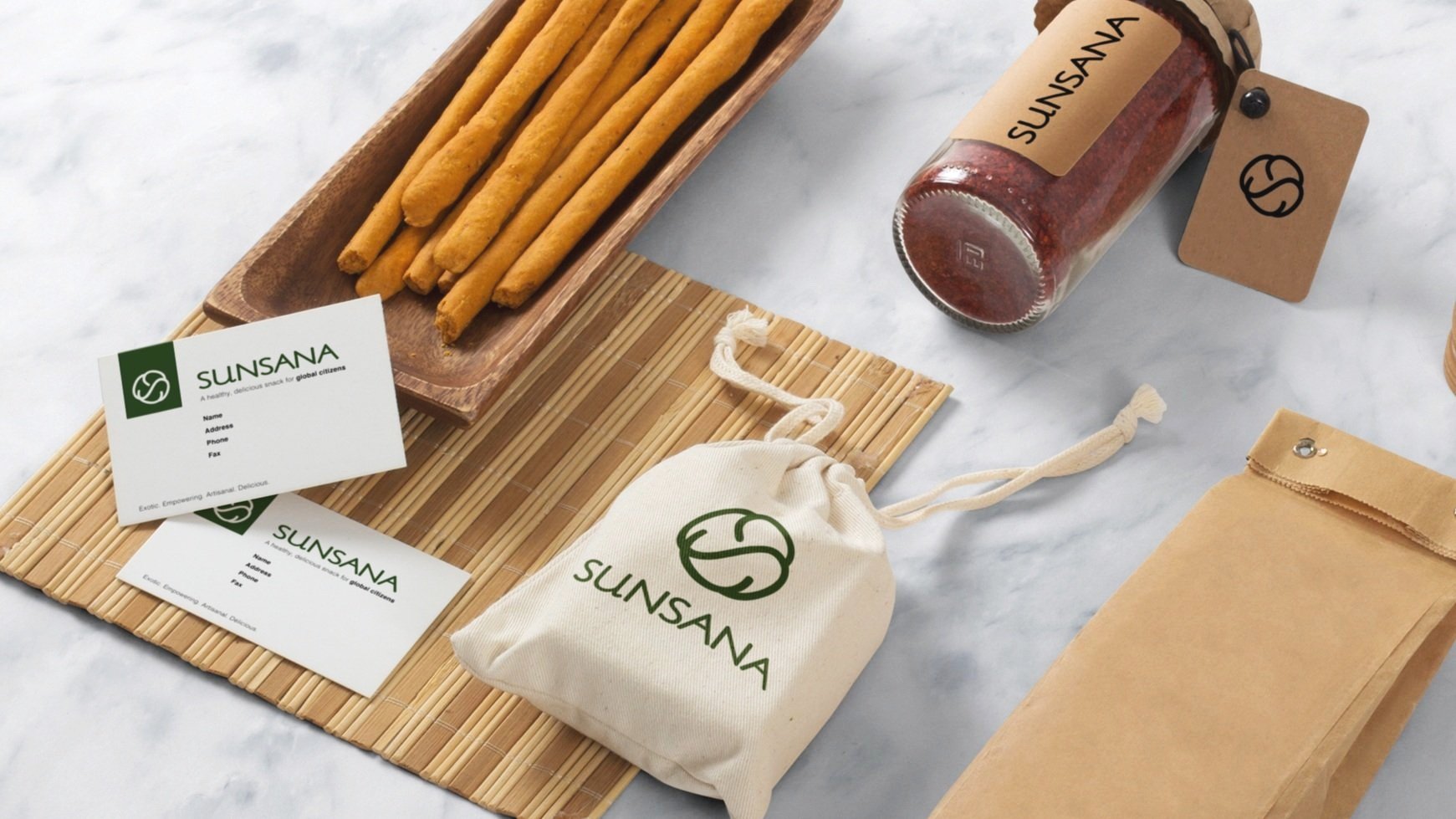
Sunsana is a startup snack company with a focus on whole, nutritious foods that do not sacrifice delicious taste. The company’s clear mission and superior products were not reflected through its unclear brand positioning and design language, and thus required a complete brand overhaul while at my time at BrandFire creative agency. A healthy snack brand market landscape study was conducted, and Sunsana was uniquely positioned as an exotic, empowering, artisanal, and healthy snack company for global citizens.
From brand to logo
A subsequent logo exploratory was conducted with three distinct logo directions and iterations to reflect the company’s natural, balanced, and yogi-inspired vibe. The favorite logo included on the collateral highlights the qualities of balance and centeredness while illustrating centripetal energy - all elements of yoga and a healthy life overall. Practically, the logo resembles their champion product (granola bites) and is made up of two S’s, representing Sunsana.


